Tuesday, May 29, 2018

Analysis of Intercontinental Exchange

Thanks to Frown88's recommendation in one of his recent posts, I got to know of the Crossing Wall Street blog and an interesting counter which I thought would merit further investigation.

The interesting counter is Intercontinental Exchange (ICE), the company behind the New York Stock Exchange and several other exchanges.

Intercontinental Exchange Logo


The Business
According to their 2017 Annual Report, Intercontinental Exchange is one of the leading global operator of regulated exchanges, clearing houses and listing venues, and a provider of data services for commodity, fixed income and equity markets. The company consists of two different business segments: (a) Trading and Clearing segment, and (b) Data and Listing services.

Their Trading and Clearing segment includes various Derivative Exchanges (one of which is ICE Futures Singapore), OTC markets, Clearing Services (one of which is ICE Clear Singapore), and Security Exchanges (New York Stock Exchange, NYSE Arca). Their Data and Listings Segment include data services which provide pricing and analytics, exchange data, and desktops and connectivity.

Backstory
First, some interesting backstory which I've come across while reading up on the company. Jeffrey Sprecher, the founder and CEO, started ICE in 2000 as an online marketplace for energy trading. Back then, one of their competitors was Enron. After the downfall of Enron, their business soared. The company struggled to handle the flood of new businesses but they eventually succeeded. In 2013, they bought over the New York Stock Exchange. Interested readers can read up about it here and here.

Disclaimer
Before I begin, there are a few things that need to be said. The subsequent analyses are based on my compilation of ICE's financials from their annual reports. The company had plenty of acquisitions and divestments across the years. Hence, the financials for a given year may appear different across two consecutive annual reports due to the enlargement of the equity base. In such cases, I made the decision to take the more recent/latest financials. As I do not know how to adjust the EPS (and other per-share metrics) for prior years following their acquisitions and divestments, my numbers may appear wonky. I have also removed data related to discontinued operations, so common sized financial statements will not tally to 100%.

Revenue
For the past 7 years, total revenue has been on an uptrend. There was a huge bump in revenue in 2014, which is probably due to the acquisition of the New York Stock Exchange. In 2017, revenue dipped by 2%.

Intercontinental Exchange Revenue Trend

In their Annual Reports, they breakdown revenue by their different business segments. Let us take a look at the revenue trend for each of their business segments.

First, let us take a look at their Transaction and Clearing segment. Revenue for this segment jumped in 2014 and has been hovering at the 3-billion level since then.

Intercontinental Exchange Transaction and Clearing Segment Revenue Trend

Next up, we have the Data Services segment. In contrast to the stagnating revenue growth for the Transaction and Clearing segment in 2016 and 2017, the Data Services segment has been growing during this same period.

Intercontinental Exchange Data Services Segment Revenue Trend

The Listings segment is a new business segment that started in 2013. Revenue jumped in 2014 (probably due to accounting the full year's worth of revenue) and has been stagnant since then. Overall, the proportion of revenue contributed by the Listings segment is still pretty small compared to the other business segments.

Intercontinental Exchange Listings Segment Revenue Trend

There is also an item called "Other Revenues" in the Income Statement. As it contributes only a small portion to the overall revenue, I would not be plotting a chart for it.

Common-sizing the Income Statement shows that, as the years passed, Intercontinental Exchange is less reliant on its Transaction and Clearing business segment. Their Data Services business is playing a larger role in contributing to overall revenue.

Intercontinental Exchange Common sized Revenue Sources

Let us take a look at the Net Margin trend next. Net margin most probably took a hit from the acquisition of the NYSE in 2013. Following which, net margin began to creep back up.

Intercontinental Exchange Net Margin Trend

Balance Sheet

Intercontinental Exchange Capital Structure Trend

Total assets have grown across this 7-year period. Correspondingly, total equity and total liabilities have increased as well, with the trend in total liabilities exhibiting a steeper slope than the former. Retained earnings have increased from $1.957 bil in 2011 to $6.825 bill in 2017. The amount of treasury stock has also increased from $0.644 bil in 2011 to $1.076 bil in 2017.

Intercontinental Exchange Common-Sized Assets Trend

In terms of common-sized assets, cash and cash equivalents have been decreasing over the last 7 years. Margin deposits, guaranty funds and deliverable contracts receivable have decreased from 87.3% of total assets in 2011 to 65.45% of total assets in 2017. In contrast, goodwill and other intangible assets have increased over the same period.

The following is observed when the liabilities and equity portions of the Balance sheet is common-sized. The proportion of total liabilities to total assets fell from 0.91 in 2011 to 0.78 in 2017 while the proportion of total equity to total assets increased from 0.08 in 2011 to 0.21 in 2017.

Cash Flow Statement
Cash flow from operations have been positive. Similarly, free cash flow has been positive as well.

Intercontinental Exchange Free Cash Flow Trend

Dividend Trend

Intercontinental Exchange Dividend History

The above chart illustrates Intercontinental Exchange's Dividend History on a per-share basis. There are a few things to note regarding the above chart. First, Intercontinental Exchange started distributing dividends in 2013. Second, yahoo finance dividend data contains errors. This is not the first time that I managed to spot such errors. For example, they double-counted one of the distributions in 2016. Hence, the bar for 2016 looks much more taller than it actually is. Third, as mentioned in the beginning of this article, there have been plenty of acquisitions and divestments done by the company. As a result, their metrics from a per-chase basis has been adjusted quite often and, as I lack the necessary data/expertise to re-adjust them, they will appear wonky. If you look at the official sources, ICE has been growing their dividends for shareholders. However, my chart is not able to capture that.

GFC Performance
When the share price goes south, dividends help income investors to stay the course. As mentioned above, in the case of ICE, they started distributing dividends in 2013. Prior to that, investors had only capital gains to rely on. This was especially painful when the GFC occurred, with ICE losing around 67% of its market value.

Intercontinental Exchange Share Price Trend

That's all folks. Thanks for reading!

Not vested in Intercontinental Exchange

Sunday, May 20, 2018

Analysis of Nongshim Co Ltd - a Korean Consumer Staples Company

This post is inspired from a conversation I had with Jeremy Ow and Sysy on InvestingNote regarding consumer staples stocks. Nongshim is one among many instant noodles brands you can find on the shelves of supermarkets in Singapore. I have tried their instant noodles, but was unaware that they were a listed company until I stumbled upon the very same name being reflected on a list of Asian consumer staples stocks.

Let us take a look at their financials.

Revenue


Nongshim Co Ltd Revenue Trend

Revenue is in Korean Won in billions. From the above chart, it could be observed that revenue is flattish over the last 5 years.

Nongshim Co Ltd Revenue Growth Trend

If we look at revenue growth in percentage terms, the numbers fluctuate quite a fair bit. Over the 5-year period, the highest percentage growth in revenue over the previous year occurred in 2015. In two other years, there was negative growth in revenue.

Revenue by Product Category


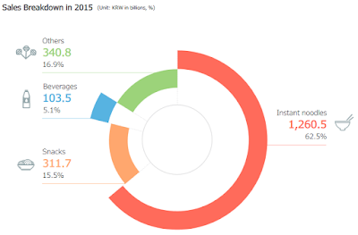
Nongshim Sales Breakdown 2017

The above screenshot shows the revenue breakdown by product category for Nongshim, on a non-consolidated basis. Instant noodles, by far, contributes the higher percentage of revenue to the company. This is followed by snacks at 15%, with Export, Import brands, and Beverages accounting for the remaining percentages.

The revenue breakdown by product category has remained approximately constant. The screenshots below shows the revenue breakdown by product category for year 2016 and 2015, respectively.

Nongshim Sales Breakdown 2016

Nongshim Sales Breakdown 2015

Earnings

After looking at the top-line, let us take a look at the bottom-line. Compared to revenue, earnings fluctuate quite a fair bit across the last 5 years. As revenue is pretty much flattish, this suggests that there may be other extraneous factors that are impeding revenue from trickling down to the bottom-line. 

Nongshim Co Ltd Earnings Trend

Common Size Income Statement

I have prepared a Common Size Income Statement to help identify which areas could be responsible for the fluctuations in earnings across the last 5 years. 

Nongshim Co Ltd Common Size Income Statement

Over the years, cost of sales have decreased, resulting in an increase in the gross profit margin of the company. Another huge chunk of revenue is taken out at the Selling, General and Administrative Expenses level. The company is then left with operating profits hovering around at the 3 - 5% level across the 5 years. Beneath the Operating Profit level, it can be observed that Other Income played a significant role in enhancing net profits in 2016 relative to other years. 

Balance Sheet

Nongshim Co Ltd Capital Structure

Over the 5-year period, total assets and total equity value have increased while total liabilities peaked at 2015 before falling.

Similar to the Income Statement, I have also prepared a Common Size Balance Sheet to identify sub-component changes in the Balance sheet across time. 

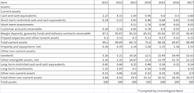
Nongshim Co Ltd Common Size Balance Sheet - Assets

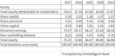
Nongshim Co Ltd Common Size Balance Sheet - Liabilities

Nongshim Co Ltd Common Size Balance Sheet - Liabilities

Across the 5-years, trade receivables ranged from 8-ish to 9-ish percent. As long as the percentage does not balloon over the years, this is not a cause for concern. Intangible assets only occupy a small position on the balance sheet over the 5 years.

The main bulk of current assets comes from short-term financial instruments, trade receivables, and inventory. The main bulk of non-current assets comes from tangible assets and real estate such as their production plants.

Retained earnings have increased from 64.54% in 2013 to 72.97% in 2017.

Cash Flow

Cash flow is the lifeblood of a business. How did Nongshim Co Ltd fare in this regard?

Nongshim Co Ltd Free Cash Flow Trend

The above chart shows the Free Cash Flow for Nongshim Co Ltd across the five years. As there is no "Property, Plant and Equipment" entry on its Cash Flow Statement to subtract from Operating Cash Flow to determine Free Cash Flow, I followed Morningstar's approach where they used "Acquisition of tangible assets" as an equivalent to PP&E.

Dividend History

Nongshim Co Ltd Dividend History

Nongshim is definitely not a dividend growth stock. Dividends distributed, on a per-share basis, have remained the same since 2004.

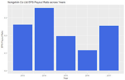
Nongshim Co Ltd EPS Payout Ratio

The EPS Payout Ratio is very healthy. For the past 5 years, dividends consumed less than 40% of earnings.

I was not able to find the number of shares outstanding from the 2017 annual report. I referred to Morningstar where they indicated that the number of shares outstanding was held constant at 6 millions shares for the past 5 years (2013 - 2017). With that information, I plotted the free cash flow payout ratio below.

Nongshim Co Ltd EPS Payout Ratio

In contrast, the FCF payout ratio chart paints a totally different picture. In 2014 and 2017, dividends paid were in negative territory. This mirrors the negative free cash flow in the Cash Flow section above.

That's all folks. Thanks for reading!

Not vested in Nongshim Co Ltd

Saturday, May 12, 2018

An In-depth Analysis of PepsiCo

At this moment, PepsiCo is one stock that is closely watched by US Dividend Growth bloggers. Over the past one year, its share price has been on a downtrend. 

PepsiCo Share Price Trend

PepsiCo is a dividend aristocrat. It has boasted yearly dividend increases for the past 46 years. Just 4 more years to go and PepsiCo will join an even more exclusive group - the Dividend Kings, businesses that have grown their dividends for 50 years in a row.

I know I will get this question, so I will address it first. Why PepsiCo? Why not the Coca-Cola Company? The Coca Cola Company is primarily a beverage company. According to the 2017 Annual Report, the company owns, licenses, and markets more than 500 nonalcoholic beverage brands, which is grouped into the following categories: (a) sparkling soft drinks, (b) water, (c) enhanced water and sports drinks, (d) juice, dairy and plant-based beverages, (e) tea and coffee, and (f) energy drinks.

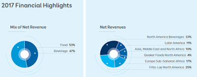
In contrast, PepsiCo is a more diversified business. It is a beverage and snacks company. A significant portion of their revenue is contributed by their snack/food business (see below).

PepsiCo revenue breakdown by segment

Similar to other consumer staples, PepsiCo's top-line growth is stagnating as consumer trends are changing. There is an increased demand for healthier food and beverage options. According to their 2017 Annual Report, it can be observed that PepsiCo has been proactive in this regard. They classified their portfolio of brands into one of three categories: (a) fun for you, (b) better for you, and (c) good for you, with the latter categories appealing more to the health-conscious folks.

pepsico portfolio transformation

Over the years, they have been building up on healthier food and beverage offerings.

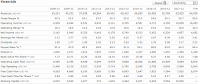
PepsiCo financials

The above screenshot from Morningstar shows a snapshot of PepsiCo's financials. Revenue has stagnated while net income has dropped in 2017.

As a dividend growth investor, the 2017 and TTM EPS payout ratio looks quite concerning. If earnings do not improve, dividend growth will eventually hit a ceiling.

PepsiCo EPS payout ratio

Another way to look at whether the dividend payout is sustainable is to look at the Free Cash Flow (FCF) payout ratio. Unlike the EPS payout ratio which includes non-cash accounting-related charges, the FCF payout ratio measures the actual cash generated by the business. Using the FCF data from Morningstar, the following chart shows the FCF payout ratio for PepsiCo.

PepsiCo FCF Payout Ratio

I do not have the FCF data for TTM though. Anyway, the FCF payout ratio looks slightly better, but it is still on the high side.

As mentioned above, PepsiCo is operating in a competitive environment where consumers are increasingly turning towards healthier food and beverage options. I would expect that per-year dividend growth would be smaller compared to earlier years. How does the data pan out? First, let us take a look at the dividend history.

PepsiCo Dividend History

The above chart is generated by my R script where I define dividend payout by calendar year instead of financial year. As the data source is from yahoo finance, if I recall correctly, yahoo tracks dividends distributed by Ex-Dividend date instead of Payment Date.

Initially, I thought my chart was wrong. The huge column in 1997 was when PepsiCo spinned off their Pizza Hut, Taco Bell, and KFC businesses as Tricon Global Restaurants (now known as YUM! Brands). I can't find any information about a "special dividend" from the spin-off though. Similarly, I suspect that any increases in dividends followed by decreases could be due to special dividends, else PepsiCo would be thrown off the Dividend Aristocrat list.

What about the trend in dividend growth?

PepsiCo Dividend Growth History

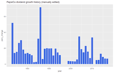
The PepsiCo dividend growth chart is plagued with the same issues as the previous chart. It may include special dividends, hence there could be periods of "negative growth" which does not make sense. After manually excluding 1997 and all the "negative growth years", I am left with the following:

PepsiCo dividend growth history (manually edited)

From the above chart, it could be said that there was greater dividend growth in the earlier years of PepsiCo than in the later years. Take my inference with a healthy dose of skepticism though. I have not manually checked and removed every single special dividend (if any) from the above chart and it may be inaccurate.

If you refer to the Morningstar screenshot above, the ROE history of PepsiCo has always been on the high side, even when net income is stagnant or decreasing. This is unusual and merits investigation. The DuPont Analysis could be conducted to break down ROE into its constituent components to identify which components could account for the high ROE. One of these constituents is the equity multiplier which measures financial leverage - the extent to which a business uses debt (as compared to equity) to finance its operations. I suspect that more insights could be gleaned from looking at this particular ratio.

PepsiCo Equity Multiplier

The table above shows that shareholder's equity is on a downtrend because of share buybacks. As a result, the role that debt plays in the company has increased.

PepsiCo PE History

The above screenshot from Morningstar shows the PE history of PepsiCo. Similar to most consumer staples in this current bull market, PepsiCo trades at > 20 PE. Juxtapose the above PE history screenshot with the previous table on Total Assets/Shareholder's Equity/Equity Multiplier and you will realize that PepsiCo bought back quite a significant amount of shares when the valuation was rich in 2015. Personally, I do not like to see this.

What about PepsiCo's valuation?

For year 2017, PepsiCo reported an EPS of $3.38 in their 2017 Annual Report. I took the daily adjusted closing price for PepsiCo from 1 January 2017 to 31 December 2017 and divided it by $3.38, followed by averaging the results by the number of days the US stock market was opened. I obtained an average PE ratio of 32.7 for year 2017. This is contrary to the figure of 24.8 presented on Morningstar's website.

What about their TTM PE ratio, if I were to calculate it myself?

Q2 2017 EPS: $1.46
Q3 2017 EPS: $1.49
Q4 2017 EPS: -$0.50 (because of tax changes in the US)
Q1 2018 EPS: $0.94
TTM EPS: $3.39
Current TTM PE Ratio: $97.43/$3.39 = 28.7

Using technical indicators, plenty of US Dividend Growth bloggers have either initiated or added to their PepsiCo holdings. It has finally breached support and is near to its 52-week low. Fundamentals-wise, PepsiCo is still pricey.

Not vested in PepsiCo. Still watching and waiting.