With the submission of my last assignment for the semester, it is time to blog again.
In my previous post, I described where and how do you get the data to plot the yield curve.
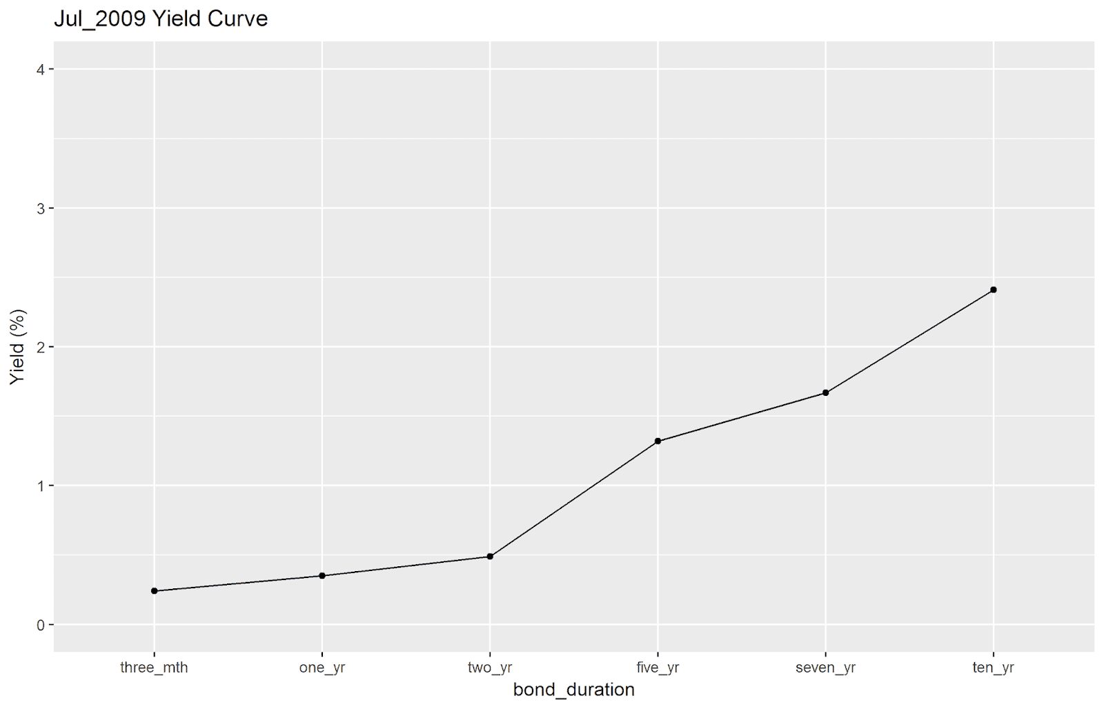
In this post, I will be spamming everyone with line graphs of the Singapore Government Bond Yield Curve from January 2007 to December 2009. The underlying rationale is to eyeball the data to verify whether was a yield curve inversion present before/during the Global Financial Crisis (GFC) and how well do changes in the yield curve over time provide us with ample warning of a stock market crash.
The answer? Not as clear-cut as I expected.
First things first. Some definitions and assumptions before we begin.
1). I downloaded the SGS data by month. If I recall correctly, it refers to the yield at the last trading day of the month (e.g. January 2007 yield at last trading day of January 2007).
2). I included the following for the x-axis: 3-month T-bills, 1-yr bond, 2-yr bond, 5-yr bond, 7-yr bond, and 10-yr bond.
3). The y-axis is hard-coded from 0 to 4, to facilitate comparisons across graphs.


Some observations of mine:
1). If you take the collapse of Lehman Brothers (September 2008) as the start of the GFC, the corresponding SGS Yield Curve looks somewhat normal. Longer duration bonds yielded more than their shorter-term counterparts. In addition, following the collapse of Lehman Brothers, the yield curve started to look more normal.
2). Generally, there is a larger yield spread between the two-year and five-year bonds as evidenced by the steepness of the line on the line graph connecting those two points.
3). Flat yield curve at January to February 2007. The yield curve becomes less flat/more normal over time, with the year 2008 yield curves looking more normal than the year 2007 counterparts. At September/October 2008 when the stock market crashed, the yield curves looked normal. Does this mean that prior to a crash, the yield curve is more flattish, and at the point/after the crash, the yield curve will revert back to normal? More investigation is needed.
4). Does this throw conventional market theory out of the window? Based on the above line graphs, I have yet to observe shorter duration bonds yielding higher than longer duration bonds (e.g. inverted yield curve). What the data shows is, at worst, a flat yield curve. There is no "clearly" inverted yield curve.
5). When yield curves are flat, a supposedly-measly T-bill yields more than a two-year bond.
Interesting stuff. I might look more into bond yields in future postings.